How to change default mailbox language for a single user or multiple users? There are…
Outlook search bar moved to top
Microsoft Outlook or also known as Outlook is a part of the Microsoft Office suite. Adding your email account in Outlook and using Outlook makes the daily workflow a lot easier. One of the functions that you use daily in Outlook is the search functionality. Now this time, when you started Outlook, you can’t find the search bar anymore. The Outlook search bar is missing, or is it moved?
The organization uses the on-premises Microsoft Office suite 2013, 2016, and 2019. We had a big update planned, and that’s rolling out Office 365 in the organization. There is a difference between Microsoft Office 365 and the on-premises Microsoft Office 2013/2016/2019 suite. One of these differences is that Office 365 is a subscription service. It ensures you always have the most up to date modern productivity tools from Microsoft. It means that the users are going to see new features and design changes. One of these changes is the search bar in Outlook. Expect to get calls or emails about the missing search bar in Outlook.
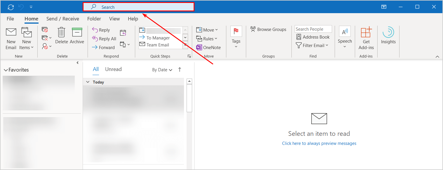
The answer that you can give them is that it’s not missing. Users, including you and me, are used to click the search box at the top of the messages and start typing. The good news is that the Outlook search box is not missing. The Outlook search bar position is moved to the top in the title bar. For some users, it feels a bit strange as they are used to it since Outlook 2003. That’s more than 15 years!
In the next part, we will look at the Outlook search bar position before and after the update.
Search bar before Outlook update
Before the update to Office 365, the Outlook search bar is placed at the top of the messages.

Search bar after Outlook update
After the update, the Outlook search bar is placed in the title bar.
At the moment of writing, it’s impossible to change the search box back to the top of the messages. You can get the search box back if installing an older version of Microsoft Office 365. After that, you need to disable automatic updates. I don’t recommend doing that as you need to get updates for security fixes and bug fixes.
Technology changes every day, and you will get used to the new features. Stay up to date and make sure that you train the staff before pushing an update without telling them.
Microsoft pushed an update to the Office 365 suite, and the Outlook search box is moved to the top. A lot of people do not like the change, what do you think?
Conclusion
In this article, you learned that the Outlook search bar moved to the top in the title bar. It’s a new feature by Microsoft, and it’s only happening for Office 365 customers. The search bar is not moved to the top if you use on-premises Microsoft Office 2013/2016/2019. If you use Microsoft Office 2010 or older, you need to update right now to a newer version! Don’t like the new position? Give feedback about this change to Microsoft.
Did you enjoy this article? You may also like Cumulative Update 17 for Exchange Server 2016. Don’t forget to follow us and share this article.
I’ve had it with Outlook365 and Microsoft in general.
I’ll be leaving my employeer soon and the requirement to use Outlook will be gone. For me that means using a desktop application like EssentialPIM or someing similar. May not solve all my issues but being free of Microsoft will be a big plus. Like government it is so large it no longer responsive to its customers.
Is there any updates on this change. I first came to notice this when I started using outlook on prem 2021. The part that jumped out at me was that you used to get contact cards when you did the search by typing their first name. I would love to have that back. I dont mind the location but when you change the functionality then its a problem.
Stupid move, MS! I HATE the new search bar location – I emailed our IT guy to ask if there’s a way to configure it back to where it was. Searching will now be more of a chore than it has to be. MS certainly has a talent for downgrading their upgrades.
Suck balls, my eyes keep getting attracted to the search bar, our company just updated to 365 what suckage that is. seems stupid for Microsoft to not at least be able to move it somewhere’ s else
I don’t mind the location, except that almost every time I click the box to do a search, the whole window shrinks and moves and I have to re-maximize it.
This is a stupid location for the search bar. Please provide the option for moving it back.
Happened right in front of me on a military laptop. Microsoft are you listening? This is fucking idiotic change it back.! These computers are already so clogged with BS security apps that any additional clumsy scrolling and clicking literally adds dozens of hours of work to a year. The exact opposite of what an intellectual worker on a PC wants.
Fuckkkkkkk.
i feel you bro
For all the people who are banging their head after new update there is a good news !!
You can bring back the search bar down by following below instructions.
Views -> Change Views -> Single -> Manage Views -> New
There you can customize your own view.
How? I can’t find the search bar anywhere in the manage views settings.
Can you clarify how you “customize” your own view to move the search bar back down? I can’t see how to do it.
I hate this feature. MS is really wrong with this useless change. bring it back to old style.
Not useful up top. Better where it was to “search for messages within the message bar”, rather than “search for messages over the file”. Next thing they’ll do is force Cortana to search your whole network with AI wasting your time going in circles (users know their PC better than Microsoft… privacy issues and timewaster trials).
One of the stupid things that Microsoft did. Once they are in monopoly, people can do nothing about it. The WordPerfect was much better than Microsoft Word, but Word now dominated the market, and WordPerfect is out.
Move it back!!
Please move it back the search bar!
Search bar at the top totally blows!
Don’t like this at all. This is just another example of Microsoft PROVING that they have ZERO clue how their customers use their products and what will help those customers and what will hinder those customers. They do things at random because THEY THINK it will help people. (Start menu gone from Windows 8 for example.) They need to back track on this one and make it configurable so we can get it out of the title bar where it doesn’t belong and back to the top of the messages frame where it belongs!
Telling us to just get used to it? Nah, switch to a different mail client instead of Outlook. Get one that actually respects their users.
Yes it is awful.
1) It feels completely disconnected out of context all the way at the top
2) The amount of times I have come to my inbox or a folder and wonder why it looks funny and then look up and see it is a search
3) When you click in the search bar it obscures the search related buttons below e.g. Has Attachments, Categories, Unread etc
4) Before when I didnt want “current folder”, i would click it and directly under it had “subfolders”. Now I have to click the search bar to expand it, move the mouse over to the left and then change it to subfolders
5) As someone who extensively uses searches and regularly, to only have my 3 recent ones shown is awful.
Why would they make everything harder and more clicks. I haven’t found one new useful feature.
Is there an official place to provide UI feedback because all this is doing is slowing down my day and making me click more.
Our corporate O365 was updated and the move of the search bar to the top is bad. Since using Outlook back in early 2000’s, I have to unlearn 20+ years of muscle memory.
If you are searching through e-mails trying to find the one you are looking for and trying out different search terms, it used to be convenient to type in a search term, click through the e-mails to see if the correct e-mail appeared, then click back on the bar to try a new search term. Now with the new location, the bar as both further away from the results (especially if using the full ribbon) AND smaller, making it a harder target to click on. When you are rapidly going back and forth, this makes the process of identifying e-mails more cumbersome. Search is probably the most widely used feature of outlook. WHY REDUCE THE SIZE OF THE CORE FEATURE AND MOVE IT TO A PERIPHERAL LOCATION?? The shortcut Windows+E was introduced to move the cursor to the new bar, and this works well when typing, but if you want to use the mouse to scroll through and click on the search results, then you would need to switch back and forth between keyboard and mouse. Based on this, this new search bar is decent when using the keyboard only but un-necessarily cumbersome for mouse navigation.
Based on all of this, I conclude that one of the following likely motivated this shift from Microsoft:
A. Microsoft has shifted it’s priority on the Microsoft365 webmail. The Outlook desktop application was redesigned to look more like the Outlook webmail for ease of development, at the expense of actual usability of the desktop app.
B. Microsoft is trying to push it’s “AI/Machine Learning”: “see, the search bar UX doesn’t even matter because our nifty algorithms will identify the right message on the first try”. LOL
Thanks for the update, but have to admit the previous placement of Search Bar before the update is much better. Would it be possible to revert? Not really user-friendly for the bar to be right at the top.
what a downgrade and waste of space and time. Hope it gets fixed in the update. Also, I cannot blame MS for not investing in a proper UX/UI team. Why would they spend money when plenty of users provide free feedback after such bad moves?
Do not like this appearing in the title bar and just a mess unless we get used to this mess being used
Exactly I was trying to figure out, how would I move my search bar down. However I couldn’t able to, then I found this article. The earlier option was really nice, it was very easy to search and track the emails. Now it is consuming a lot of time to search each and every email.
MSFT is retarded
Changing the search bar position is probably the worst update I’ve ever seen.
I don’t know about that… I’m still mad that the calendar doesn’t switch shades of color every month so you can quickly see you are in another month! I also hate that you can’t color code messages – just categories.
I’ve been a software developer for 35 years and can’t believe how poorly software is written these days and how it gets changed for no good reason and with no consideration for usability. What are all Microsoft’s UX designers doing? And Google is worse.
Completely agree !
Especially the change for no good reason, its as if M$ don’t use their own software, else they would have noticed, right?
How Many M$ Software Engineers does it take to change a lightbulb?
None. They just define darkness as an industry standard.
If you’re going to update something like this, at least make it modular so we can move it back. And UPDATE, implies new and better. This is new, inconvenient, and inflexible. I would consider this a UI downgrade. These comments go back pretty far, evidently Microsoft doesn’t care at all about what its users think. This is probably the dumbest update I’ve ever seen.
Most pathetic and worst experience ever. All corporate user uses this search every minute. Older version was better where you can add options like from, to, subject, body. New experience is worst.
Its nightmare experience. MS to run pilot before forcing such a change in UI. it’s mess
this is really pathetic experience, I liked the old search bar where we had the flexibility of customizing the fields but now every time I’ve to go to dropdown to select the fields. What kind of update is this to make user experience worst..
What a nightmare experience for customer !!!!!
Absolutely the worst place for me and I’m sure a lot of users. For one, we should have the option to disable the search. I rarely need to use this feature. 2, I use the top of the window to move Outlook around on my screen. As usual, Microsoft trying to fix things that aren’t broken and then turns around and breaks a perfectly good setting…
i Agree, worst place to put in !!
was there a need of doing this , it made our life so difficult , kindly change only this option to the older version please.
Really worst change done by Microsoft. If they roll back it most of the customer are happy
Really bad update. When i click the search on the top, i get a dropdown, which automatically hides the search options below on the ribbon (Subject, From: , Sent to: ).
Disastrously wrong decision.
Agree
Agree with all comments posted here. Awful decision by Microsoft to move all the way to the top… would like to have the option to change it back.
I can only repeat one of the previous comments: This is one of the the MOST DESTRUCTIVE AND UNPRODUCTIVE UI CHANGES I HAVE EVER SEEIN in MS OUTLOOK !!!!!!!!!!!!!!!!!!!!!
I work in a very large software company and can say that upgrades, updates and continuous changes in particular in Cloud Software solutions must happen very often, sometimes even in short time intervals. HOWEVER, the END USER shall not SUFFER from those changes (!!!!) , and a significant change in the UI layout & design as here for the Search Bar in MS Outlook – one of the most used functions in addition to reading and writing emails – is a horrible change, and if such changes are done by a software provider , a “minimum user-friendly” offering would be at least to provide an configuration option, so that the end user can decide to go on with the new (default) search-bar in the ribbon or as before above the email section . Really VERY disappointing !!!!!
Totally agree, what idiots are doing these changes, they should be fired!
What an idiotic change!!! What were they thinking to mess with a perfectly fine setting it once was. Now it is simply doesn’t work. This is a total disaster. Bring the old setting back!!!!!
Awful awful awful!
This makes searching for emails (a vital part of my daily job) extremely frustrating!!!
Yes, i agree this was a poorly chosen update. I have been trying to get ised to it for a week and am still getting frustrated. I wish they’d chamge it back, or at least give an option.
It’s a complete disaster. The title bar has a major function that everyone seems to forget: it’s the ONLY place in the window one can click in to move the window around on the screen.
I thought the OS was still called Windows, with an “s” at the end… so hey, give me a chance to have more than one window and move it around!
Other office apps at least allow to collapse the search box and make a little bit more space available in the title bar – outlook does not. How’s that for consistency, by the way?
It is just not natural. I use the search box a lot and simply find this change to be an idiotic way to show the Microsoft management that ‘we’ at the ‘innovation department’ or whatever it is called do something. Decision was probably made over a ‘light soy quarter strength chai late’ that not only caused headaches to the millions of Outlook users, but also a massive stomach upset to whoever embarked on that morning cafe purchase adventure.
I hate it!!! Agree with every comment against this. Its not an issue but would like to have the option to change it back.
I hate this feature. MS is really wrong with this useless change. bring it back to old style.
It’s certainly not helping me. I already have several (10-12) buttons as Quick Access toolbar in Outlook 365 and all the other Office 365 applications. This search box now takes over large part of the title bar area and as a result many of my Quick Access toolbar buttons are now not visible and I have to click a sort of ‘more…’ button to see them. It’s defeating the whole purpose of Quick Access Toolbar which I have found to be an absolutely time and space saver.
Really useless change. Seriously, for the last 14 years it has worked perfectly well….muscle/mental memory knows to look for the search bar where it was. Seriously annoying to change this….if its not broke don’t fix it.
Microsoft, please, please, please, please, please, please, please, please, please, please, please, please, please, please, please, please, please, please, please, please, please, please, please, please, please, please, please, please, please, please, please, please, please, please, please, please, please, please, please, please, please, please, pretty please with cherries on top put the search bar back to where it was.
I work in IT support and I have received almost 50 tickets for this. I finally ended up sending an email to all my staff that this is not a f**ing issue.
Ah, Rick, but it IS an issue to the people like me who use Outlook every day. Why would Microsoft choose to put the search bar in exactly the WRONG place? And even worse, not give you a way to put it back where it belongs? Where it is now makes it look like its searching the whole web instead searching within the email list, which is what it is doing. Microsoft really blundered on this one and I just hope that they come to their senses and put the search bar back were it was, where it belongs. It’s little annoying things like this which can cause people to give up on Microsoft and run to its competitors. Pure idiocy!
whoever made this change has an IQ of a fucking potato,
the whole team who worked on this feature needs to get fired ASAP.
braindead idiots.
Maybe they are from Idaho, ha ha. You comment made me laugh…
Yeah totally agree, what a very stupid idea
Not happy with this new change at all.
The worst thing: I can just tell it ‘what to find’ but cannot tell ‘where to find’. It starts searching in whole mail box. I can’t specify a specific sender or subject or body or with in a specific date range etc. So it gives tons of irrelevant results causing wastage of my time in filtering these results again.
You can, those options are just hidden behind the suggested search popup. You have to click outside of the search to see them, select what you want, then click back in the search box. There is no way to disable suggested searches that I can see. It is really stupid…
Hi,
I also hate the new location of the search bar, even more since at the old location there is now a ‘search people’ search field.
Regarding the location: You can permanently change the location to ‘current folder’ in the Search settings (File -> options -> Search).
Grtz,
Karel
when “genius” like this will not arrive to face that what can be useful or new nice thing for some can be a very disaster for others ……this is the result that we can have? to do the same “war” like when other
previous genius wanted to “cancel/hide” the “DESKTOP” from win8 thinking that the PC WORLD could be a smartphone touch………
they need 2 years and loose lot of money before to understand it ……. so what now? do we have to start the same battle? should be tell all the peoples DO NOT ACQUIRE outlook license and by another product? or maybe take something that is free?
maybe at that point they will understand ……
and that as nothing to do with “a surprise that peoples have to be used to” …
The guy that made this should be fired… simple as this..
the most stupid decision I’ve seen in quite a while.
and the justification for not allowing to move it back (on microsoft’s site uservoice) is just ridiculous…it’s there for ages and now they’re worried about bugs?
“Most are surprised by the change because we are used to having the search bar in a specific place. It has been there for more than 15 years. To access the search bar, you can use CTRL+E or F3.”
No, most are surprised because the geniuses at Microsoft decided to move the search bar to the top of the screen, for absolutely no reason, literally zero. There is literally no benefit, and instead several consequences like the fact that you have to navigate between the top of your screen and the mailbox now.
People aren’t surprised because Microsoft changed something, they’re surprised because they did it in such a stupid and non-intuitive way, it’s incredible whoever thought of this idea hasn’t been fired yet.
Couldn’t agree more- it was convivence the search when the search bar is within the emails area- this makes searching a hassle as you have to move up and look down at the same time.
who came up with that decision ??????
Holy……what a pain this new search feature is.
MS are saying the search is faster.
That does not make if faster for you to search for an email.
We use folders for emails as same sending company can be attached to different jobs
The need to search a sub folder is now more time consuming and we have to use a short cut CTRL+E to even have the option of only searching current folder.
Frustrating….
Who in the heck thought moving the Search bar to the top was a good idea. Don’t you guys do Beta testing before you release changes? It’s more cumbersome, takes more clicks to do a search. The drop down covers the buttons I need to PERFORM a search. Seriously!
Plus the search bar is up and out of the normal mouse cruising area for most buttons used. Either give the option to move it back or just “MOVE IT BACK!
The issue with having the Search Bar on top is that it drops down on top of the Search keywords, i.e. Subject, hasattachment, etc, so you can’t use them anymore because they are behind it. It’s useless now.
Exactly! This is the problem I have with it. Once I type a keyword in the search bar, suggested searches appear which cover up the “From/Subject/Has Attachments” etc. So I have to click off, then select, it’s a real pain. Very inconvenient and not productive at all.
I totally agree with Vi, please give us the option to move the search bar back. It doesn’t make any sense having it up there.
Please move it back!
I use the search bar very often. I was really unpleasantly surprised that it has moved all the way to the top. It was much more accessible before, and this will take more time to move the mouse cursor there and back and cause me to lose a lot of productivity in one of the main tools I use. Please move it back!
Is there a shortcut key for accessing the search bar?
Most are surprised by the change because we are used to having the search bar in a specific place. It has been there for more than 15 years. To access the search bar, you can use CTRL+E or F3.
I extensively used the search drop down, which can’t be accessed with a shortcut. I also had the fields ordered: From, To, Received, Subject, Body, Attachment, etc. in order. The drop down now shuffles the fields into alphabetical order.
This is single handedly one of the the most destructive and unproductive UI changes I have seen – for what?
How does this ever get approved to get deployed?
Are you saying people just need to get used to the new location? Just because the search bar has been at its previous location for 15 years, doesn’t mean there was anything wrong with it that needs fixing. Isn’t updates supposed to be new and improved? This is not an improvement. Where is the option for search customize your search? The new search bar gives you a drop down that covers the ribbon. Major fail.
Is there an option to add fields for search (example – “to”, “from”, “subject”…), as it was available in last version of Outlook?
This is my main issue with this change. They are still there, but they are hidden under the dropdown. I spent a lot of time looking for them before I realized they were still there. I don’t get what this was supposed to accomplish or who asked for it